


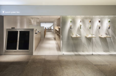
nana’s green tea LUMINE EST
Tokyo, Japan / 2018
”Color shift”
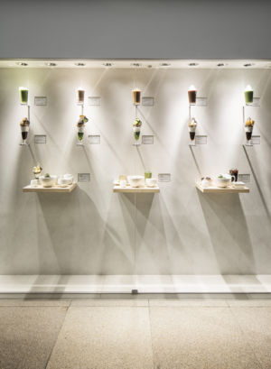
Nanaha is a company that sends to the world “a new shape of Japan” by introducing various perspectives to look at drinking matcha – Japanese powdered green tea.
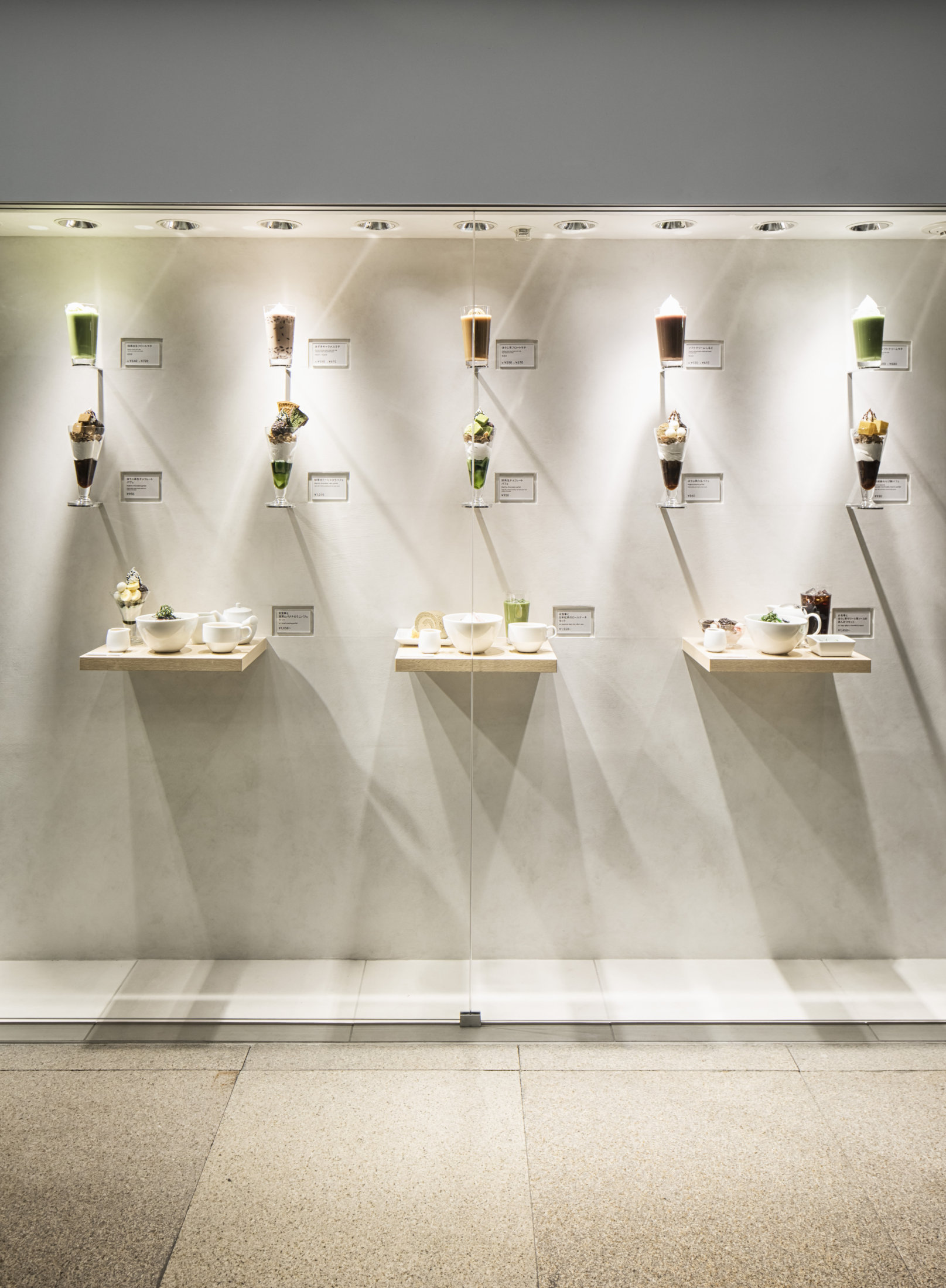
It offers, through modernly arranged menu, a high quality matcha, such as matcha latte and so on. As the owner of the store expressed himself: “ I want to create a store where people can enjoy a traditional Japanese tea culture in a modern sophisticated way”, a desired shop space was designed to reflect not “Japanese style interior” but a modern tea room.
In Japan, since the Asuka era, the use of certain colors was decided according to the social status and position. In later periods, there were some restrictions and limits on what colors could be used. This was due to the fact that the dyes were mostly extracted from a natural color of plants and were determined by its value. However, most of the people had a strong desire to wear various colors, not only the ones which were permitted. Therefore, as an exception, a new regulation was issued, allowing, when possible, the use of previously banned light color threads.
As an example to illustrate the idea, ikonzome, a pale pink which is considered to be a traditional color of Japan, is a color that can be dyed by using two hundred pieces of silk combined with 600 grams of a red dye safflower. In other words, as mentioned above, this light pink color was approved to be worn as “a permitted color” by those of low social status.
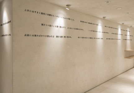
On the other hand, Sennorikyu, a tea ceremony master living in Muromachi era, by means of wabisabi spirit, was keen on simple and plain color scheme. However, to oppose this style, Hideyoshi Toyotomi, created a space called “golden tea room” with only gold and red as the symbols of political power and authority. In this example, the value of primary colors is clearly reflected.
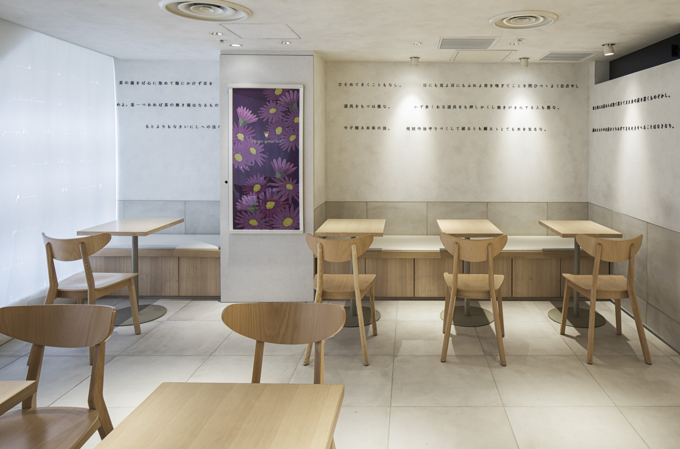
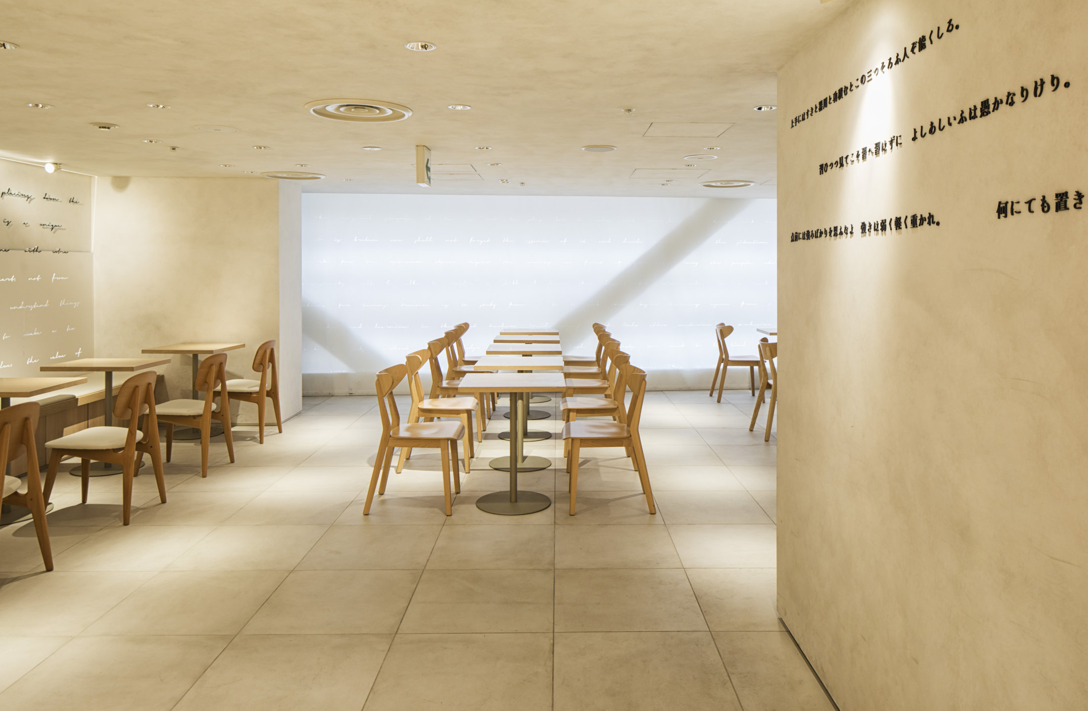
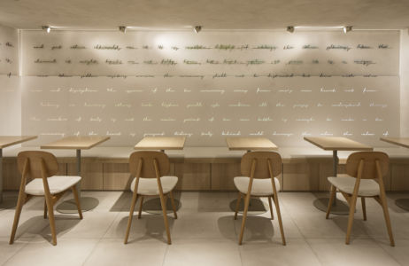
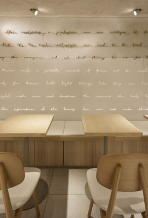
Accordingly, Nana’s Green Tea Lumina East store aims at returning to the origins of spreading green tea culture widely to the general public. It proposes to create a modern tea room with pale and light colors.
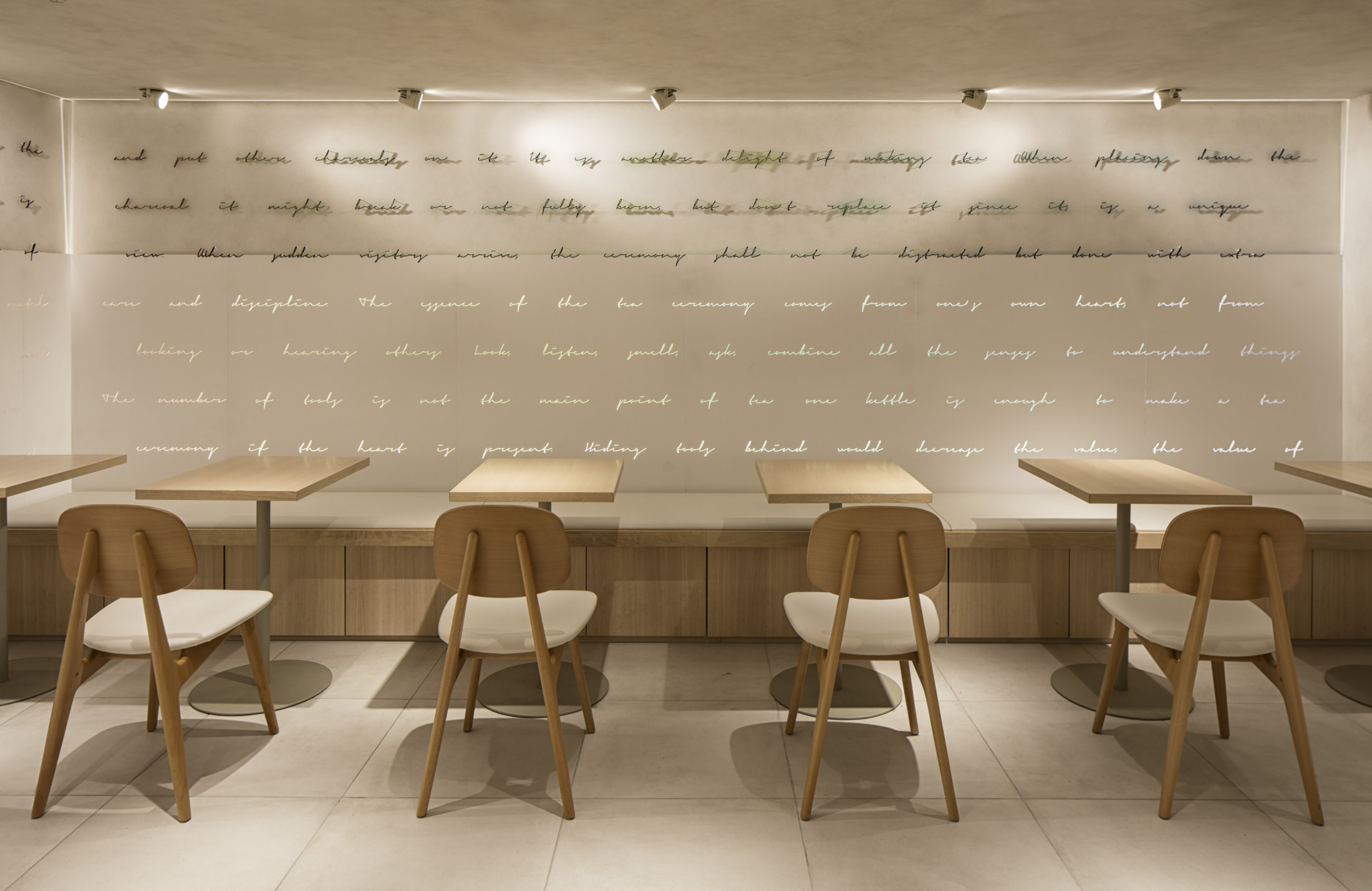
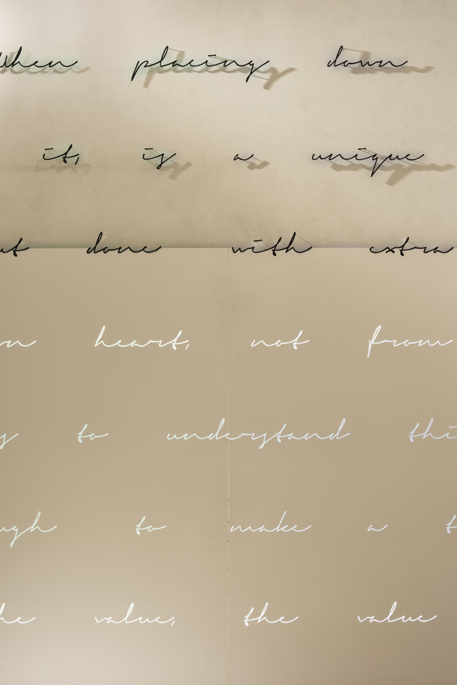
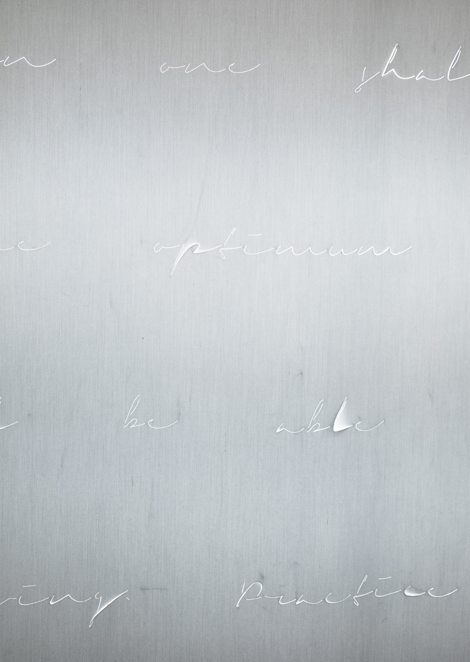
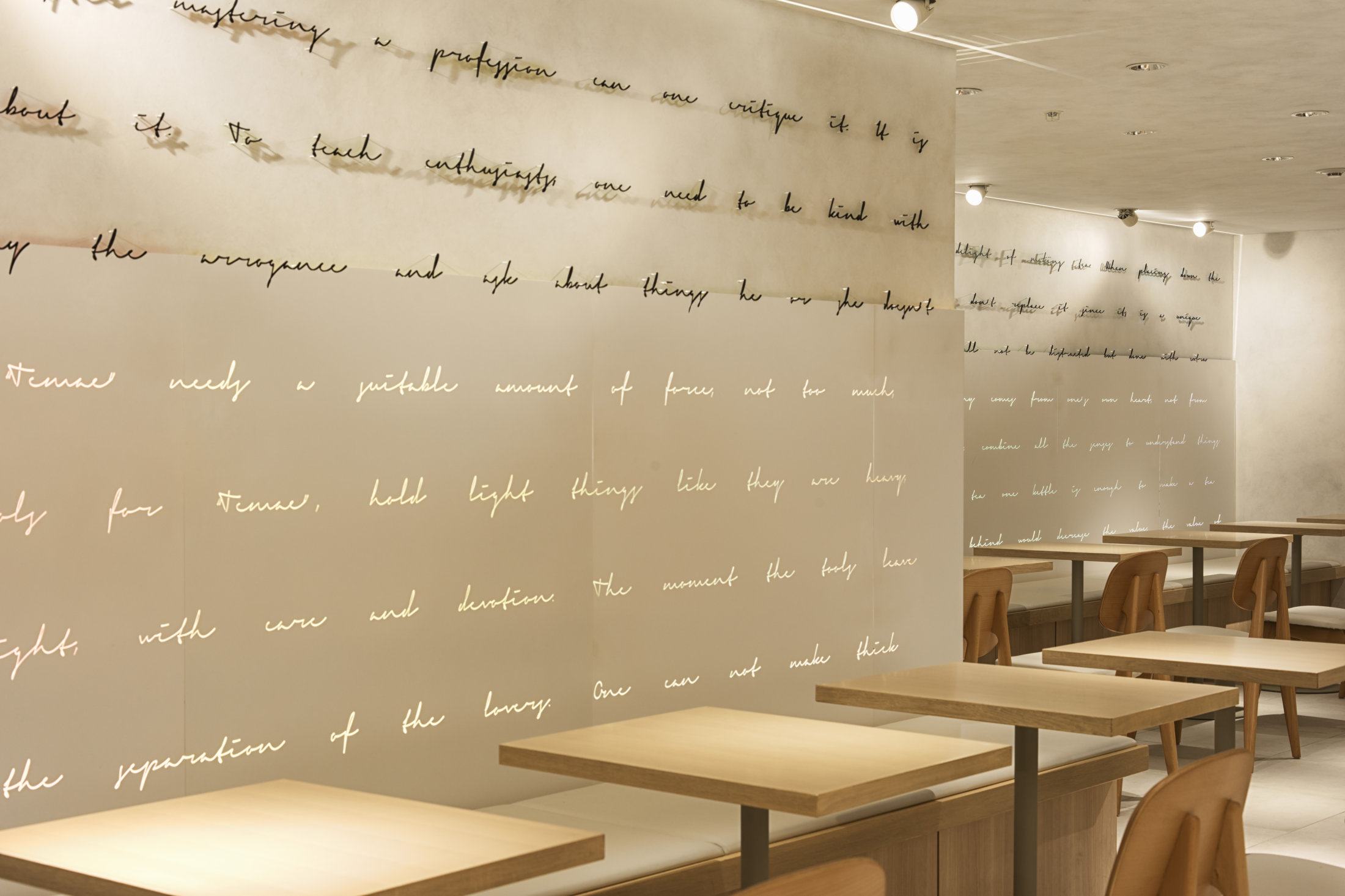
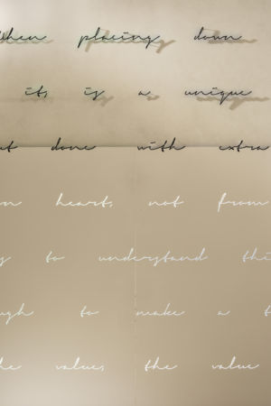
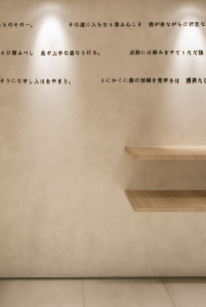
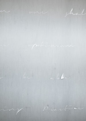
As a method and design approach, we tried to add to the space pale colors by applying a phenomenon of shifting colors. This occurrence appears due to some reflection when a primary color approaches a pure white material.
In fact, we can say as an example, that the hanging scroll showing a seasonal landscape scene corresponds beautifully with the words written on it. Exactly the same as the use of a phenomenon mentioned above. As a matter of fact, a hanging scroll becomes a great tool expressing the hospitality of tea ceremony as weal as the heart and spirit of a particular season.
Having said that, this seasonal color, as it shifts to the wall, turns into pale tones adding to the space an unusual color scheme.
Designed by Masahiro Yoshida, Yoshie Ishii and Honoka Watanabe
Photos by Keisuke Miyamoto
< PRESS >
Kenchiku Chishiki Dec.2020 issue
< AWARDS >
2019 – SKY DESIGN AWARDS WINNER
2019 – Kukan Design Award 2019 WINNER
COPYRIGHT © KAMITOPEN - ALL RIGHTS RESERVED.