


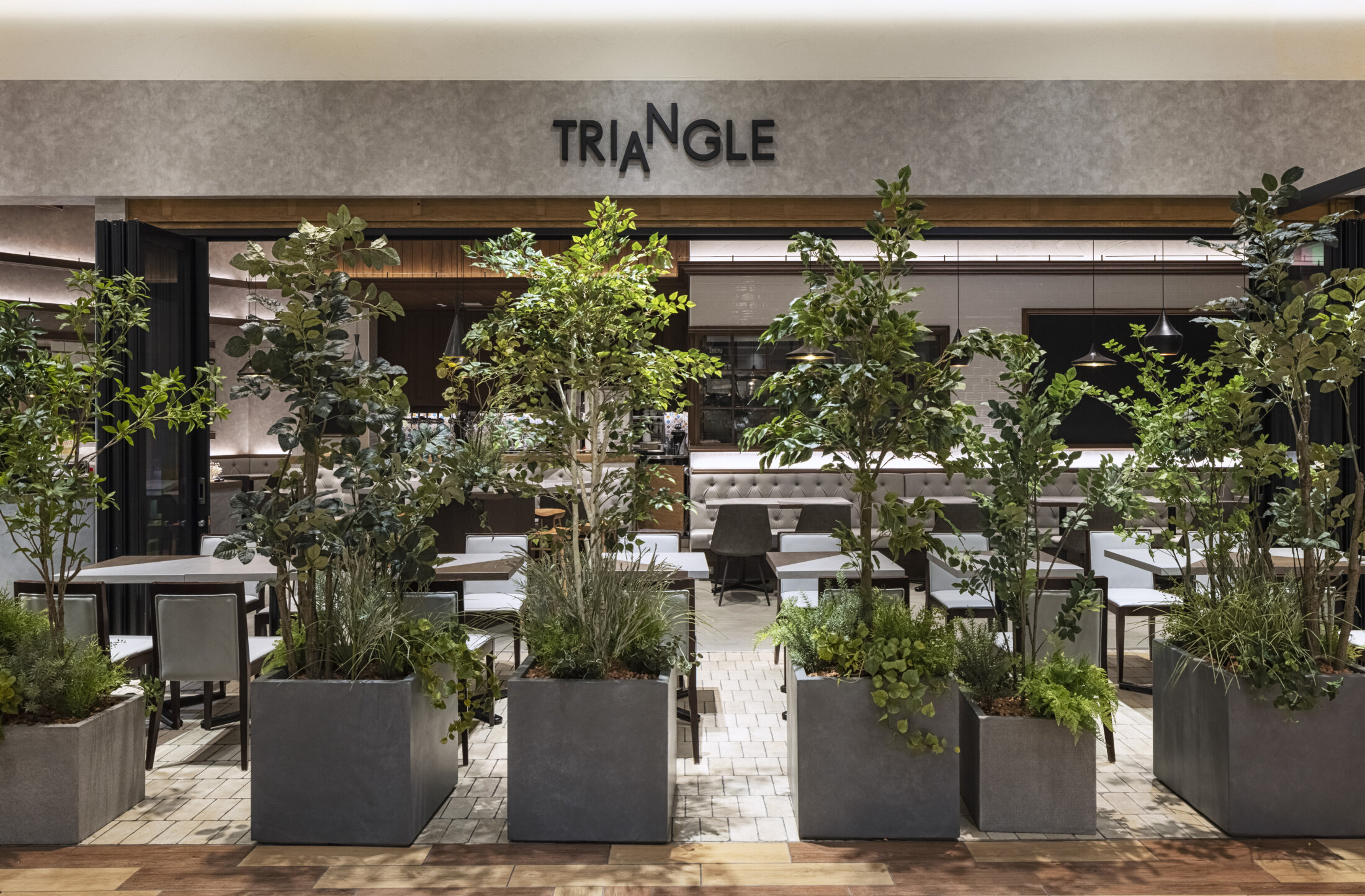


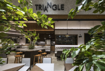
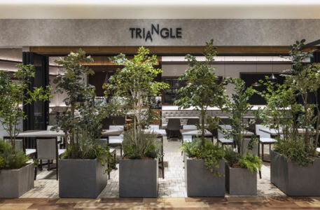

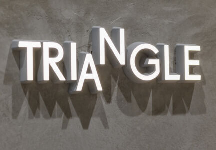
TRIANGLE
Kanagawa /2024
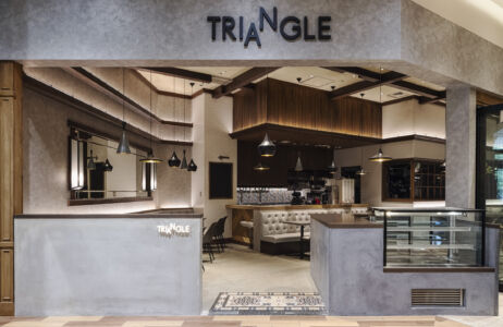
“Grey”
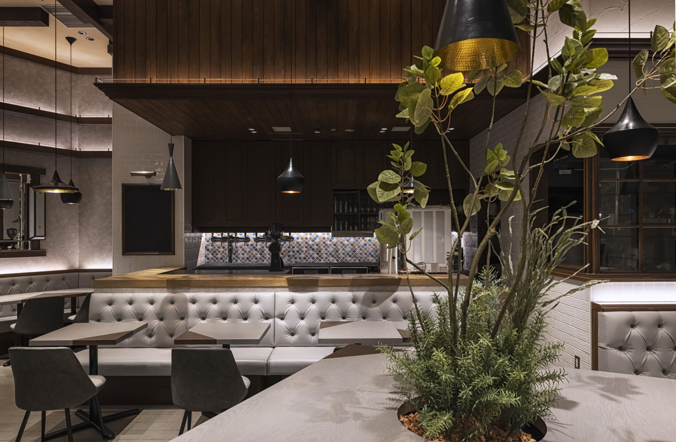
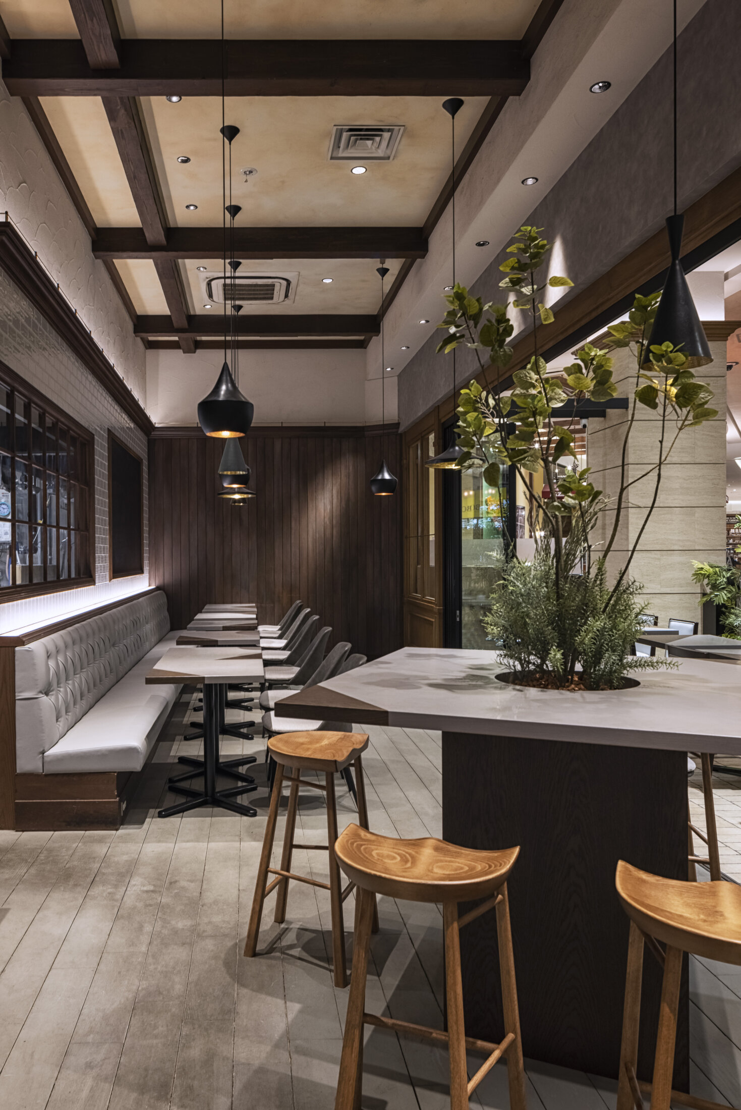
The client had a straightforward request: “I want to use gray tones.”
With this in mind, we incorporated “gray” into our design concept.
Historically, two types of gray are recognized: one from around 700 AD and another discovered in 1825. The word “gray” originates from the Germanic language, meaning “to shine, to glitter,” and it is also associated with the image of shiny silver.
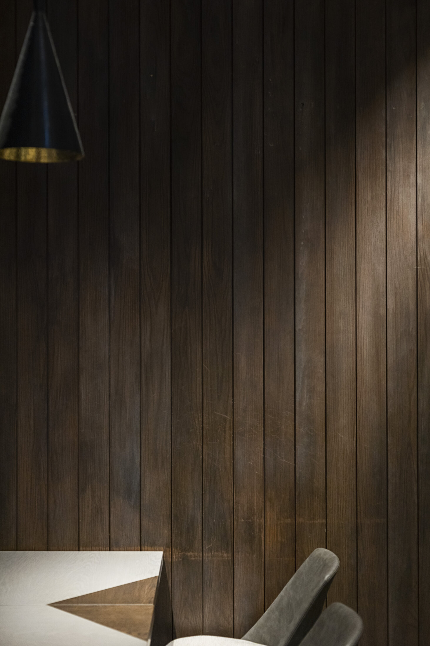
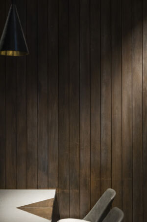
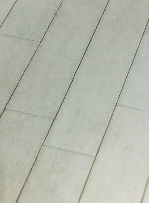
In Japanese, various shades of gray are distinguished, such as ash gray and slate dark gray. Subtle color differences are noted, with ash gray tending to appear yellowish and slate gray taking on a bluish hue. This variation is attributed to the way wood burns, leaving a slight reddish or yellowish undertone before turning to ash.
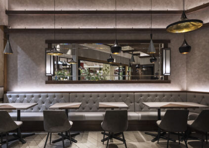
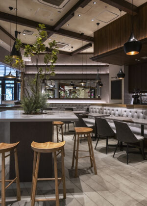
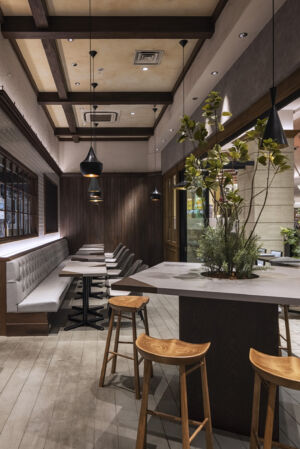
Therefore, in our design, we incorporated the reddish tone of burnt wood into the base color of the space to capture the essence of Japanese gray. For this renovation project, we carefully selected which existing colors to retain and which to overlay with gray, adding new materials to achieve the desired tonal balance.
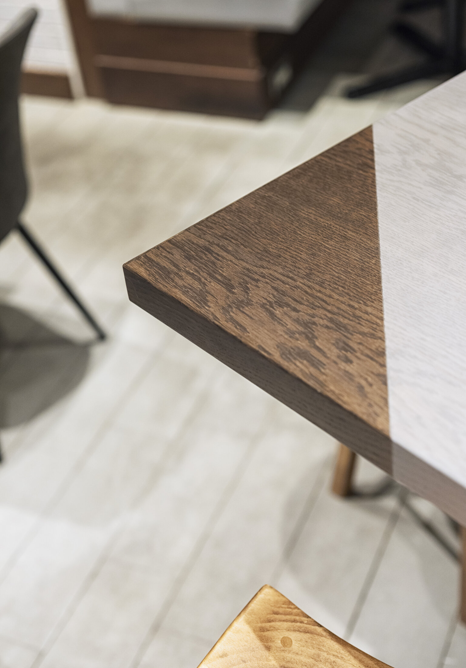
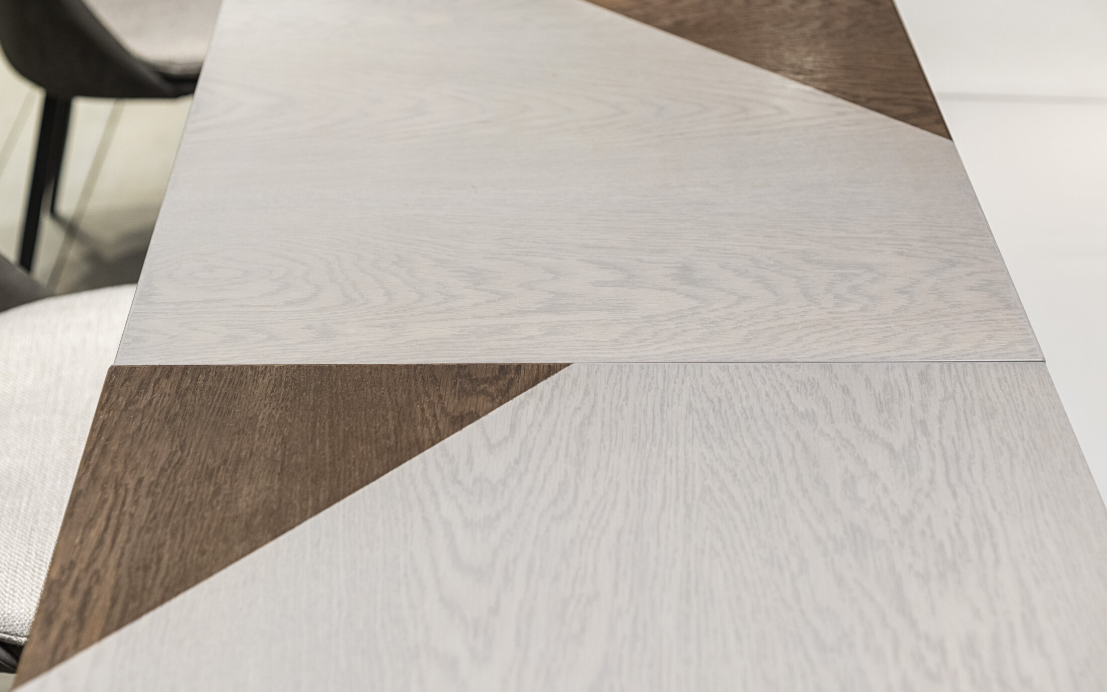
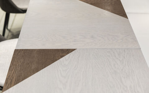
Additionally, to reflect the store’s name, “TRIANGLE,” we accented the design by dividing the wooden grain of the desk into triangular shapes.
We hope visitors can appreciate the unique grayness of Japan through this design.
Design:Masahiro Yoshida, Hyeong Wook Kim
Photo:Keisuke Miyamoto
COPYRIGHT © KAMITOPEN - ALL RIGHTS RESERVED.