nana’s green tea KOBE HARBORLAND
Hyogo, Japan / 2010
“Interior in green”
Nanaha Corporation is a company which disseminates a form of ‘new Japaneseness’ to the world, looking at ‘high quality maccha’ (green tea).
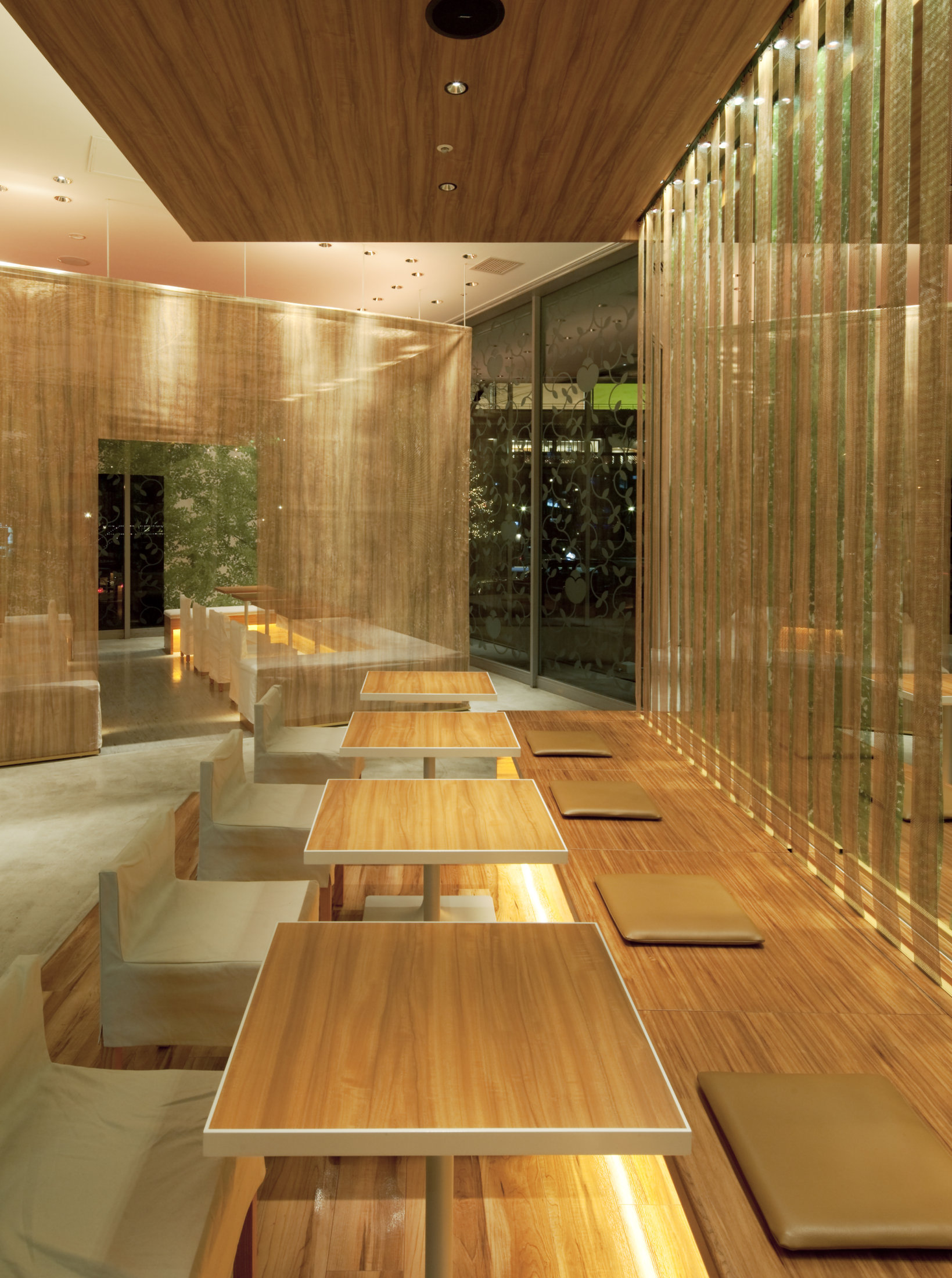
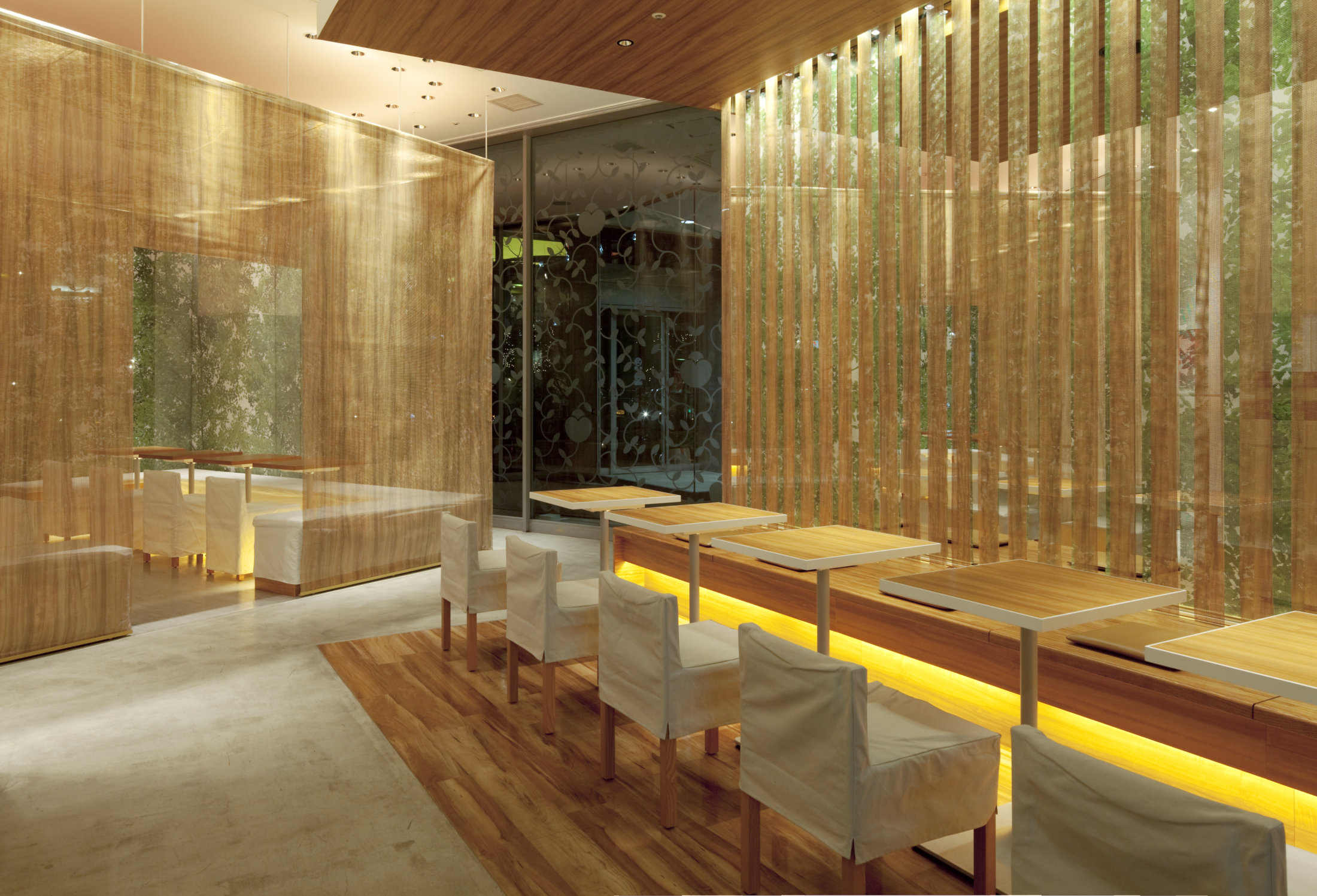
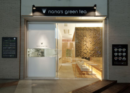
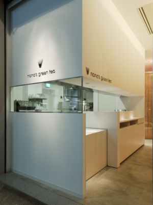
What is required for the shop is space not in typical Japanese style but a ‘modern tea room’ which is aimed to represent owner’s belief that makes customers enjoyable typical Japanese tea ceremony in modern style.
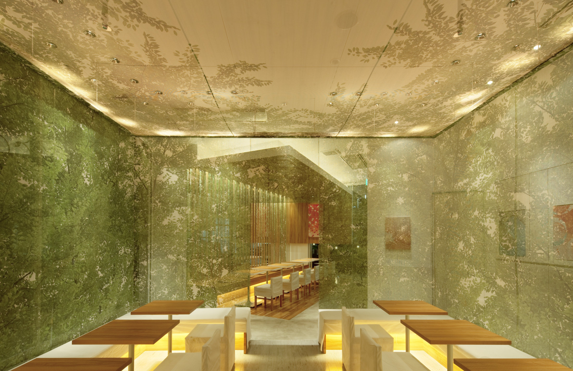
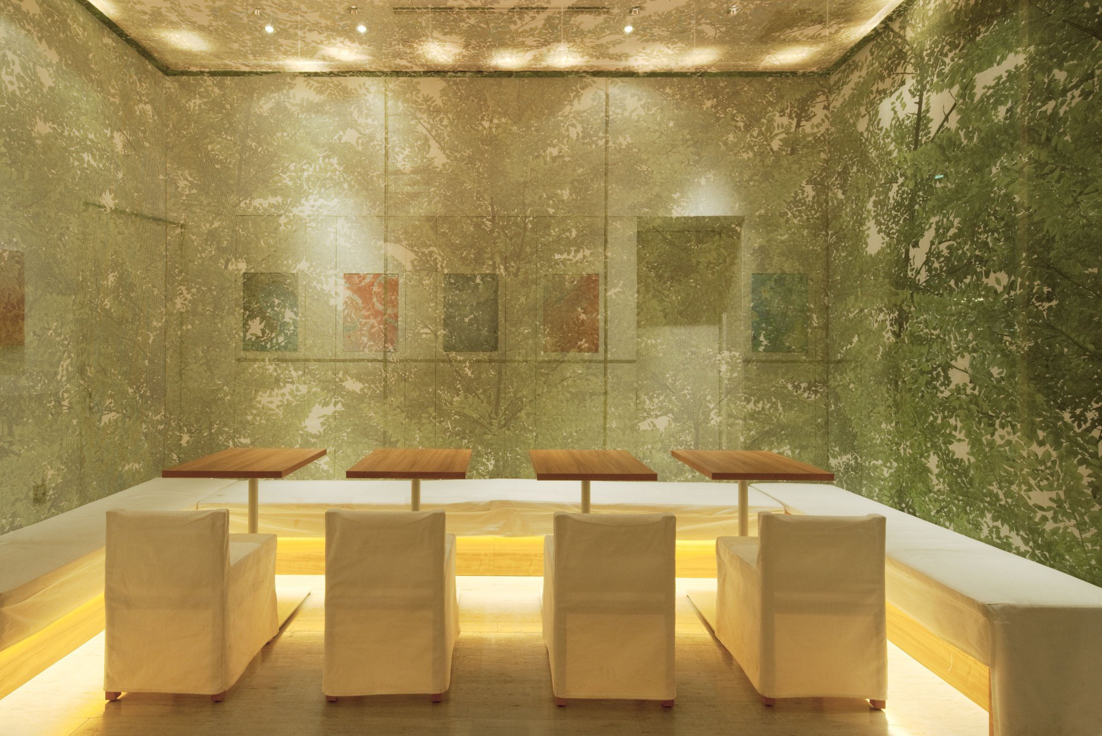
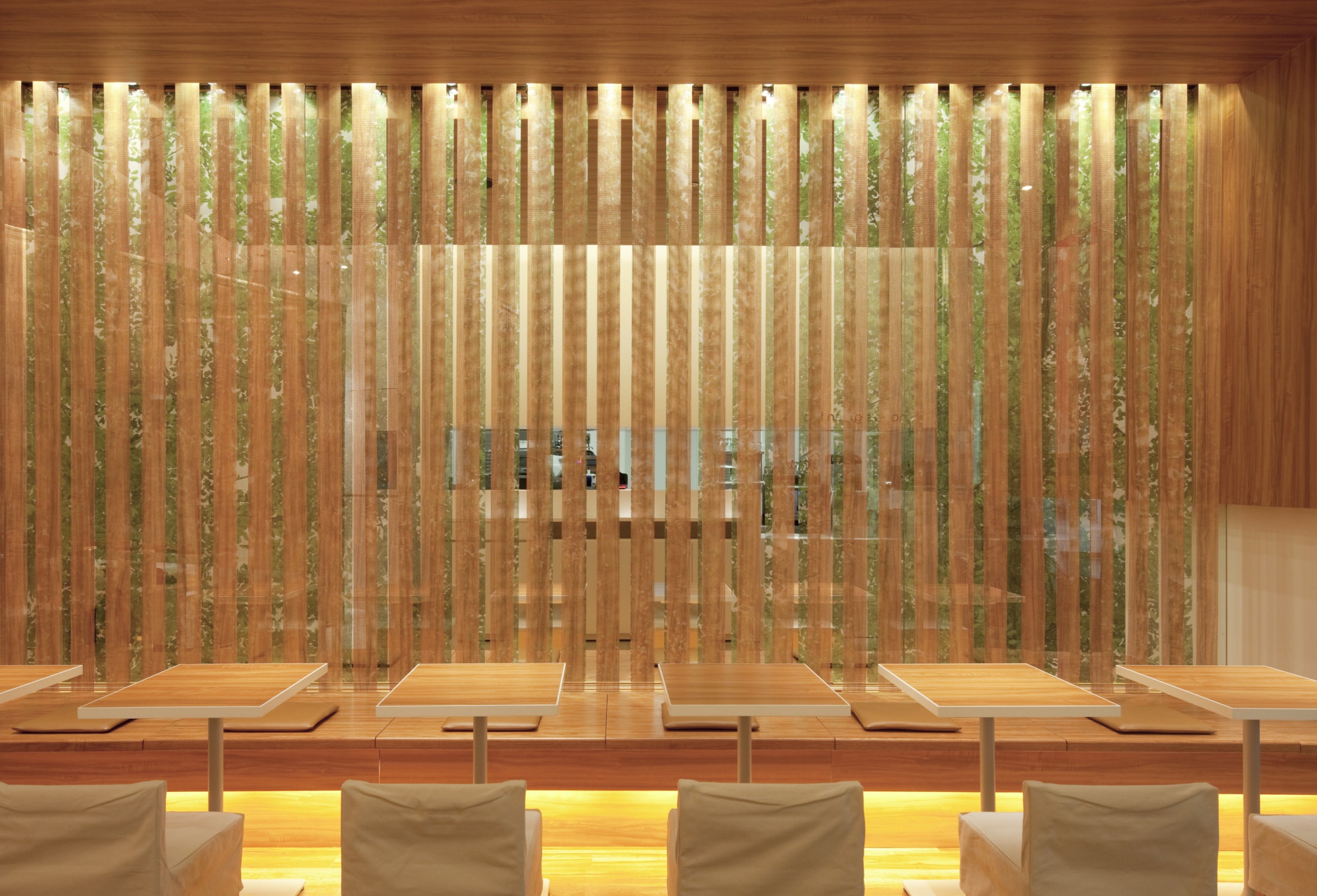
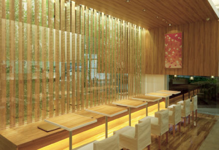
At nana’s green tea Kobe harborland branch, I designed interior in Japanese aesthetics throughout which people have enjoyed nature in paintings of nature on Fusuma-Japanese style sliding door and walls since born of Zashiki style.
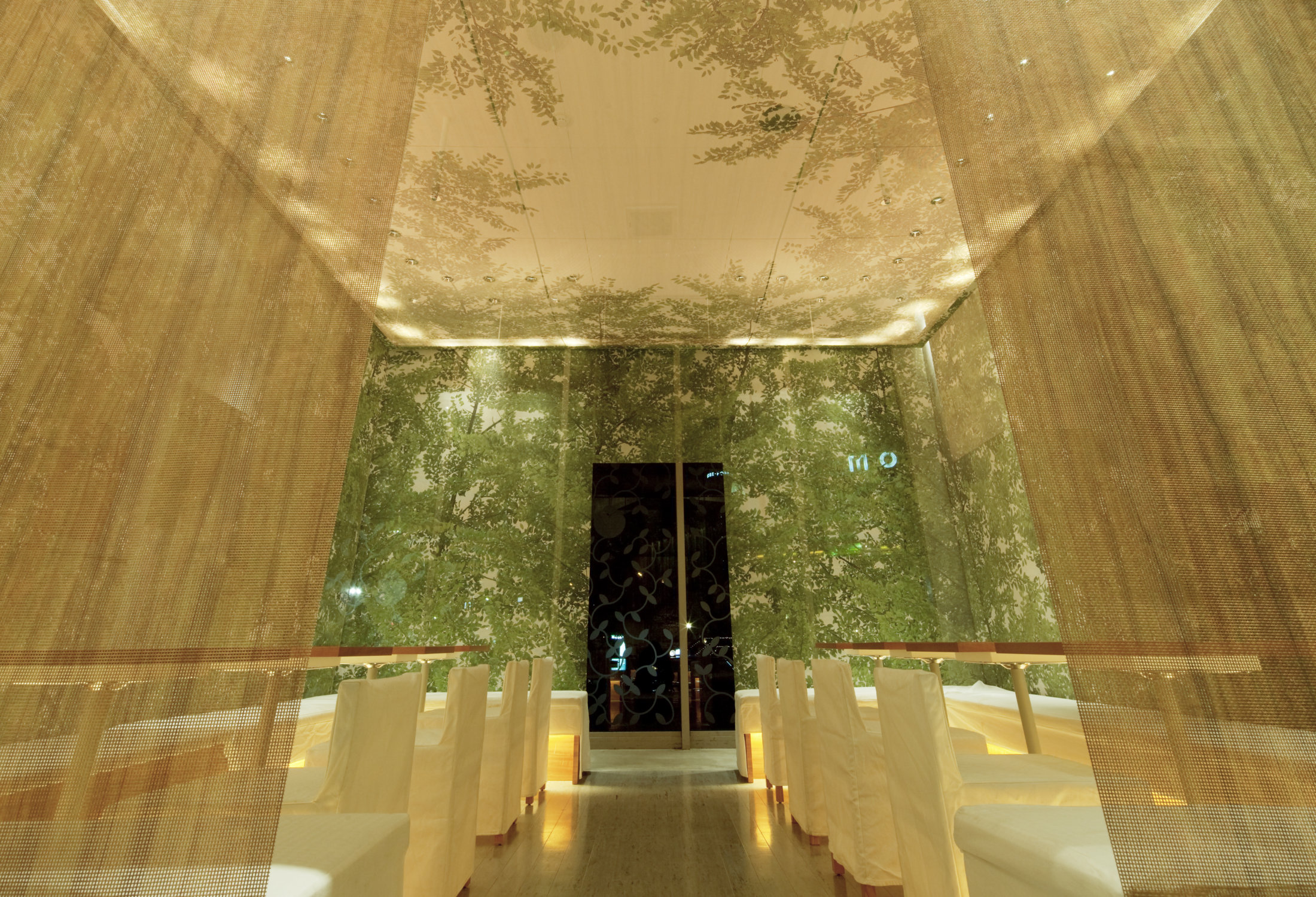
I designed interior with explaining ambiguous partitions between interior and exterior through theme of En.
The word of En means both partition between inside and outside and connection between people and nature.
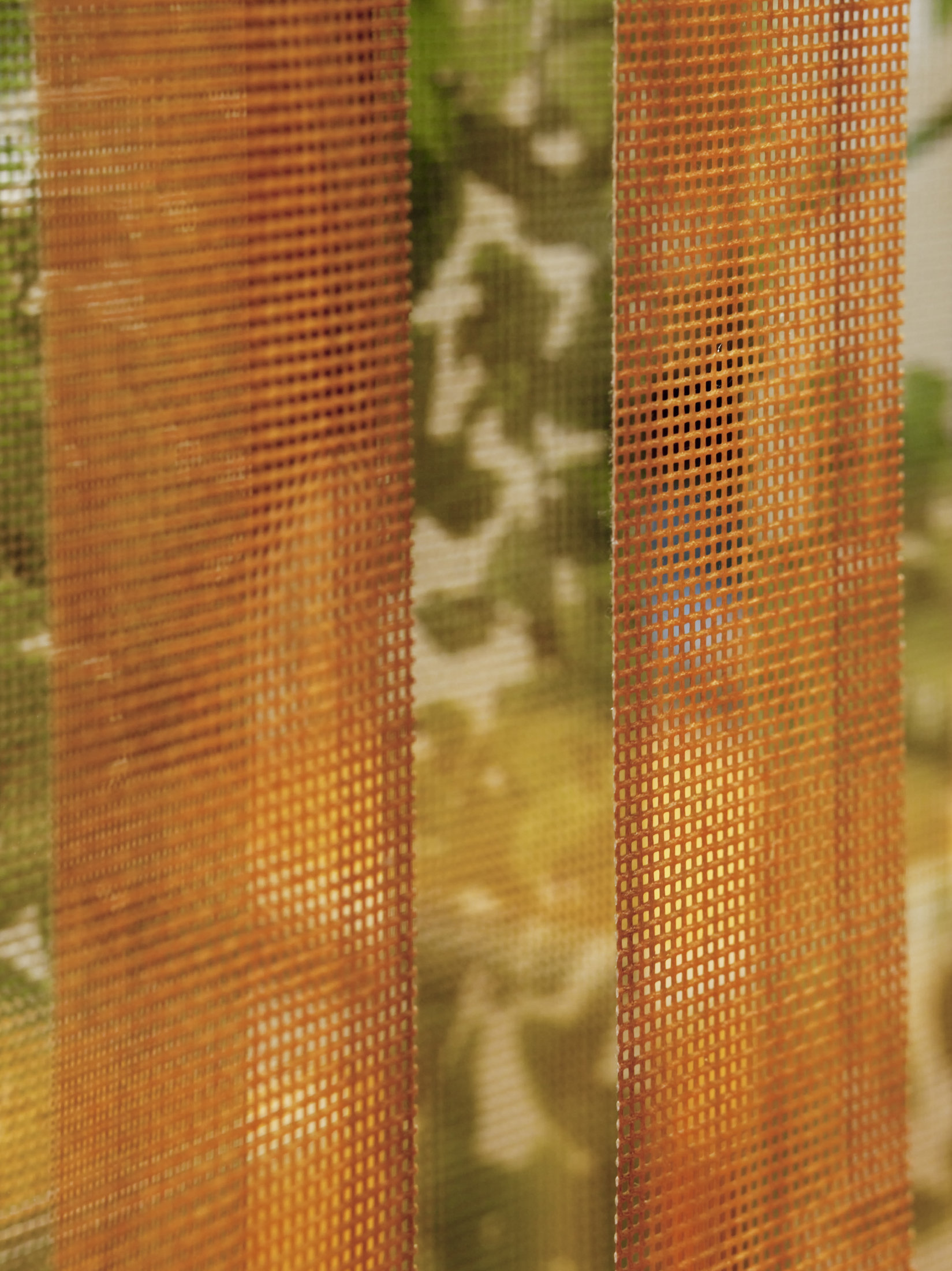
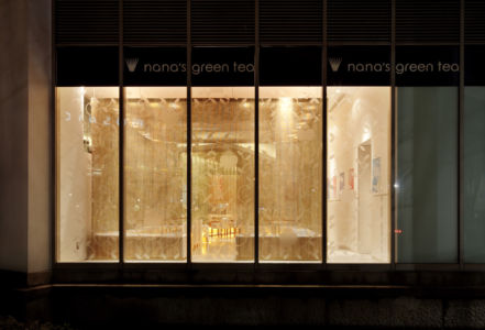
I use special sheet –turbo screen, which is normally used for curing sheet at construction site, printed different images on both-side. This Transparent but bilateral character is to represented En.
Photos by Keisuke Miyamoto
< PRESS >
Shoten Kenchiku May 2012 Issue
ASIA PACIFIC TEA HOUSE (China) Oct. 2011 Issue
MARU (South Korea) Oct. 2010 Issue
Shoten Kenchiku Sep. 2010 Issue
POP EYE Aug. 2010 Issue
Signs&Displays Feb. 2010 Issue
< AWARDS >
2010 – JCD Design Award 2010 – Best 100
2010 – The 44th SDA Award – WINNER
2009 – The 18th BEST STORE OF THE YEAR
– SPECIAL PRIZE
COPYRIGHT © KAMITOPEN - ALL RIGHTS RESERVED.

